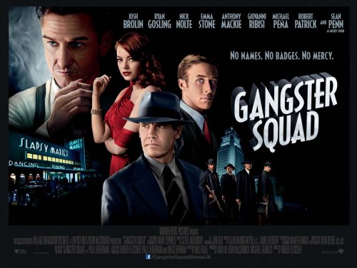
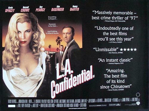
With a Top Ten list up on the other blog about Gangster Squad. That came with the poster for the film and, yet again, it felt familiar.
This familiarity was quite easy in comparison to the Wolverine poster that drove me mad for a couple of days. It just reminded me of so many posters from the 30s/40s gangster films – I think it was the font. To the late 90s when I started dealing with films professionally.
The film was, unsurprisingly this one. If the posters have anything to go with, and their similarities, then they should have a sure-fire hit on our hands…
Both posters do share some things in common. A similar, slanting logo that has a hint of a 60s font. Pseudo-painted faces on the poster and a location, possibly, from the film so you don’t forget where the film is set.
If you don’t believe me then you can watch the trailers for both films and let me know in the comments below.


