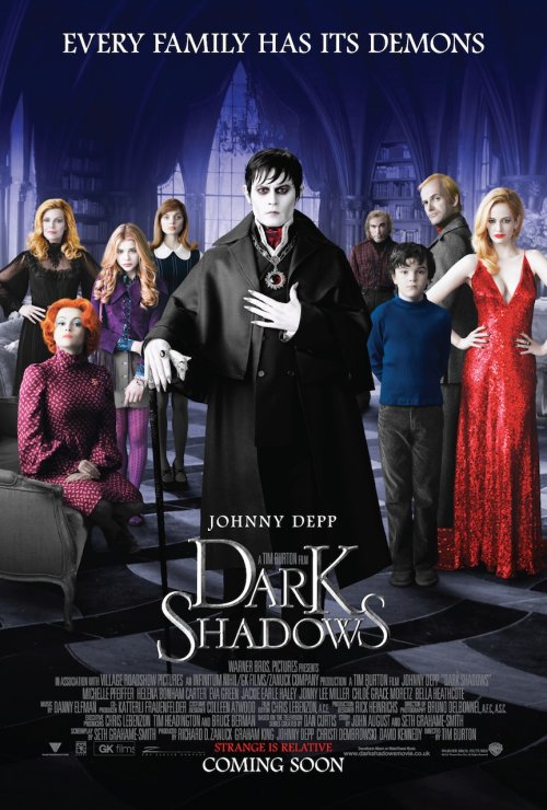
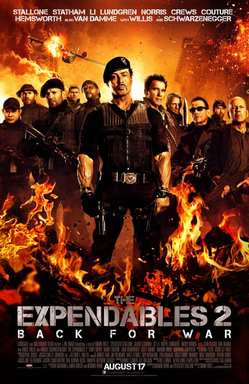
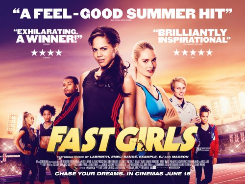
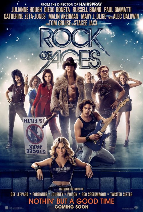
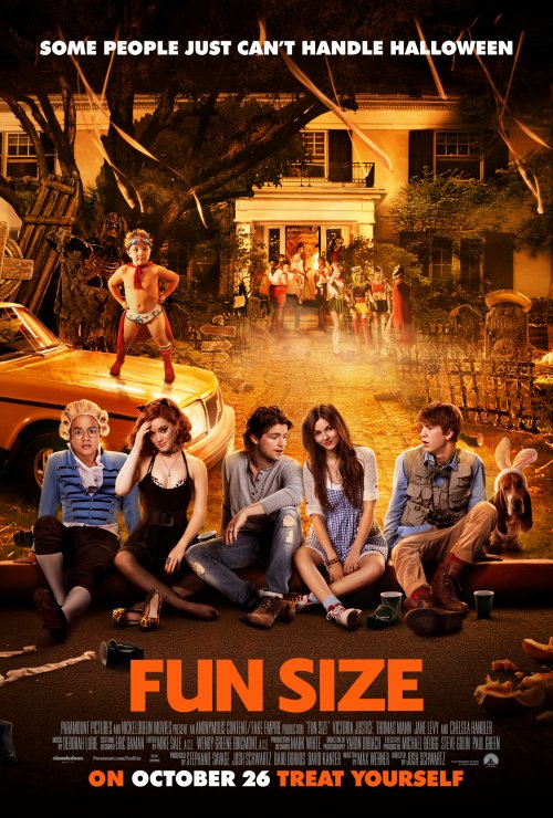
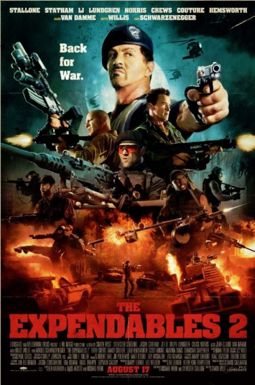
It seems that 2012 was the year of dubious photo shopped posters. It looks like it is split into a couple of camps; mainly being either a montages of the main cast “together” in a V formation or the main cast together in a line. A great example of the first type is the Expendables 2 poster with a close second from Fast Girls. The other type is seen below.
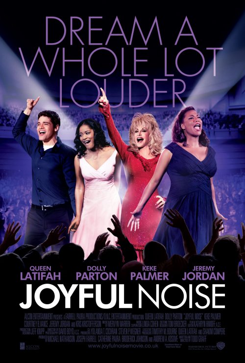
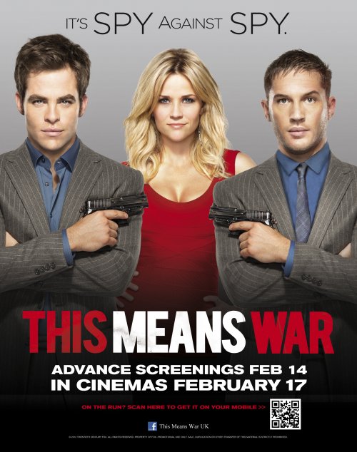
The other one is the group shot that implies that they were all together when the picture was taken. Two examples of this are below. It’s quite noticeable on the This Means War poster as you can see the feather used to make Chris Pine and Tom Hardy to appear in front of Reese Witherspoon. Joyful noise seems to have gone down a different route.
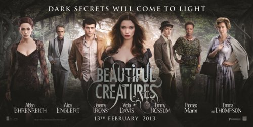
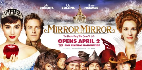
This phenomenon isn’t just the domain of the poster but it also appears on “banner” type posters:
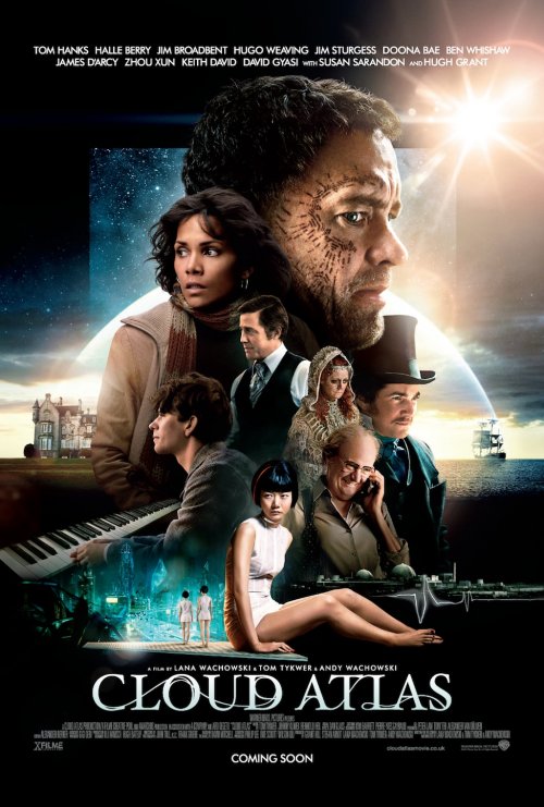
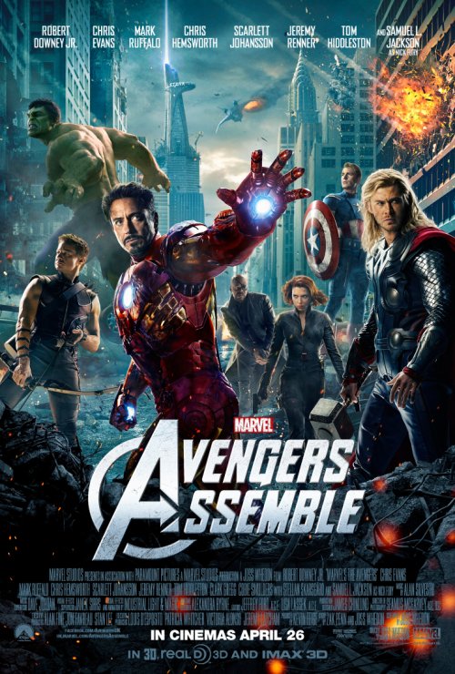
The final type is, in my opinion, the worst type. You can describe it as the splatter effect. Put all the ensemble cast in the poster not caring that much of where they are as long as they are there. Also depending on how high up the bill you are the smaller your character is on the poster. The prime culprit of this seems to be the Avengers Assemble poster. Running a close second is the Cloud Atlas poster that seems to have too many star names to fit onto the poster.
The final type of lazy posters is the mixed type. This shows the main cast in one of the two above poses with scenes from the film superimposed either behind or below the cast.


