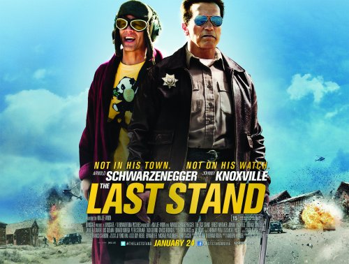
2013 kicks off as 2013 left us. With bad poster design. This time it’s for the unanticipated Arnie film, The Last Stand. Showing the same feel as this poster, but remembering to do some tiding up when the two layers, sorry, people overlap. If you do believe that they are in the same place at the same time then I would advise you to, at least, get your eyes checked out.
The first thing that crosses my mind is Why has Arnie decided to work with the “actor” – Watch him in Men In Black II to see how “good” he is – Johnny Knoxville
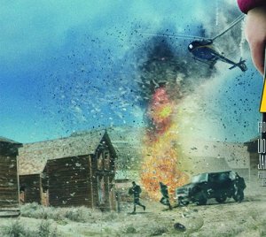
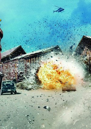
That’s the most offensive bit taken care of. Now to the other things that make this poster a little annoying. I think it’s for the people who don’t know or have never seen a film with Arnie in it. One of the things that is in all of his films are shown in glorious colour on the poster – that being big explosions!
 Looking at the below part of the poster made me think that the poster’s designer has left in the camera helicopter…

They do seem to have all of the features of the trailer in one montaged splatterfest of guns, cars, explosions and helicopters! I’m sure nothing that’s on the poster appears in the trailer. It maybe that they have decided to give away the final, heroic, shootout on the poster but not on the trailer.


