Over the last couple of weeks, I have seen both amazing posters and one done by a designer who seems to have run out of inspiration on the day.
I have already talked about the use of colour in posters as well as what can go wrong when the designer has a bad day and the client doesn’t notice the cock-up!
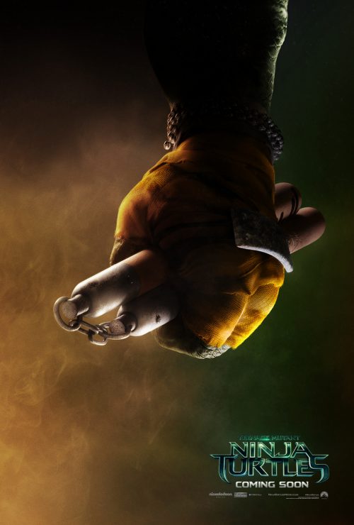
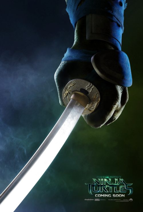
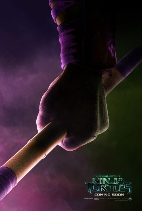
The amazing ones are the character posters from the reboot of Teenage Mutant Ninja Turtles. What make them so good is the simplicity of them. As you can see, all you can see is just an arm and the relevant turtle’s weapon. Instantly recognisable without any extraneous images. Simplicity is sometimes all you need.
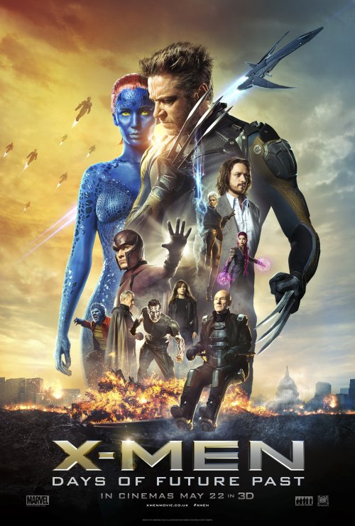
On the other end of the spectrum is the one for X-Men: Days of Future Past. It just looks like the designer has got two large images of the characters that are driving the plot and then putting the rest of the main characters inside the outline. The characters are beautifully cut-out. There is nothing wrong with the execution but the overall feel is “it’s a bit of a mess” or “It’s a rush job and the client approved it“. I’m not saying that the second one happened, mainly for legal reasons, but it does have that feel to it.
Not only looking a bit messy, it uses the clichéd orange and blue background motif that has been done to death.
There is, for me, a good thing that comes from the poster. It’s in the background near the top. One one side you can see the X-Jet – nothing unusual there as it;s the X-Men’s primary form of mass transport. The strange thing is on the other side. The things chasing the jet. If you can’t see exactly what it is then have a look here for a close-up of some of the objects. It’s the baddies. The Sentential robots.
The conclusion you can draw from this is quite simple. Simplicity works a lot better than a complicated one. Think of the posters that stick in your mind and what they contain. I’m sure you will find most of them are simple. There are exceptions to this but that’s for you to recall. Arguments are fine, just leave them below.


