 This is another controversial posts. I haven’t done many but they do produce a lot of comments. This one will be no exception.
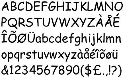
I say that Comic Sans is a good font! It’s just how the font is used is what causes hatred.
The give-away should be the first part of its name, Comic. It’s not called Serious Sans.
It was never designed to be used by anyone. It was originally designed for Microsoft Bob. However it was never used in that short lived project. It was inspired by, as you could have guessed, by comic books. The ones that were lying around Vincent Connare’s [the font’s designer] office. More specifically Watchmen and The Dark Knight Returns.
 It’s a great font for children. It’s easy to read and looks different to other fonts that can be chosen.
The font is defined below. It’s the last two words that people should pay attention to. Informal use.
Comic Sans – classified as a casual, non-connecting script for informal use.
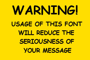
Use and embrace it in infant and junior schools but then try and wean people off it when they get older. Forget about the font then. It just makes you look bad and whatever you write will not be taken seriously. Use Times New Roman for that sort of thing.
If you want to use a font for warning signs or anything that should be taken seriously then DO NOT use Comic Sans. Use Veranda, Ariel or even, god forbid, Helvetica.


